
Introduction to Website Colors for Lawyers
When you use LawLytics for your law firm website, you don’t need to worry about color selection because we curate the best colors and color combinations for you. We’ve done the research and the work to ensure that your colors will not only match your brand, but that they will also make the biggest psychological impact on your potential clients.
If you’re looking for a simple way to pick the best colors for your website without spending time, effort or energy on the subject, and without taking chances or guessing, we suggest that you take a look at how it works with LawLytics by requesting a demo.
If you’re looking to get into the weeds and develop a deeper understanding of website color theory for lawyers, this blog post (and the video towards the bottom of the page) will give you a great overview of the topic.
Why Law Firm Website Colors Are Important
Colors can be very subjective. Your website is usually the first visual impression a potential client gets of you and your firm. What do you want it to say about your firm? Will it inspire or reassure them? Will it cause doubt or anxiety and trigger the part of their brain that governs flight or mistrust? Believe it or not, color has a big say in what your potential clients subconsciously feel about your website, and your firm. Whether we like to admit it or not, people do judge books by their covers, even the colors of them.
Color sets a mood and creates an emotional response in your audience. It’s the same as with your physical office. You want potential clients to feel at ease. And you want them to be able to concentrate on the important matter at hand, and feel confident that your office can help them. So, color, like first impressions matter greatly. Set the wrong mood or create an undesired emotional response and it’s going to be an uphill struggle from there. You’ll have put people in the wrong frame of mind to absorb your content or to consider hiring your firm, or you may lose their trust altogether. So, what colors are you thinking about? Law firms, in particular, probably don’t want to use puce anywhere on their website. Fairly safe to say.
Colors can help reinforce a law firm’s branding, messaging and overall perception that you are the best choice for legal representation. It’s not just about colors themselves, but how they interact, how they impact the specific messages, posts and calls-to-action on your web pages and how they can help guide a reader’s eyes through a series of messages. When considering how colors will work best for your website, take a holistic approach, keeping in mind your overall brand and all of its components.
Color & Brands
Let’s take a step back and think just about color in relation to brands. When we consider the branding world at large, it’s plain to see that many brand images are inherently defined by their color.
Fast food brands, and all restaurants, really, need to be very conscious of their color choices. Ray Kroc and McDonald’s studied colors and their effect on people’s hunger and discovered the red and yellow combination made people hungry as well as made them feel in a hurry: both good effects for a fast food establishment, who want people to order food and then move along:

Would it mattered if they had used these colors…

Quarter pounder, anyone? Yes, it would’ve mattered, but they never would’ve used these colors. Even if our reactions to colors can be subjective, there are some areas that simply don’t feel right. We exaggerated the color differences to make another point. Quite often, are gut responses can guide us quite well on what colors we shouldn’t use. Trust your gut responses to colors! Although, it’s harder to pick what exact colors we should use. So, let’s step back from brands and remind ourselves about the foundation of how we see colors and how WHERE we see them make a difference.
General Color Theory
The general theory is that humans refined their eyesight faster than the other senses because it furthered survival the most. As our world became more civilized, our eyesight began to help with aesthetic decision-making. We evolved to use colors to set the mood, to catch attention and to send all kinds of messages.
Without light, there would be no color. Light is made up of energy waves which are grouped together in what is called a spectrum. Light that appears white to us, such as light from the sun, is actually composed of many colors. The wavelengths of light are not colored, but produce the sensation of color.

The wavelengths our eyes can detect are only a small portion of the electromagnetic energy spectrum. We call this the visible light spectrum. At one end of the visible spectrum are the short wavelengths of light we perceive as blue.
At the other end of the visible spectrum are the longer wavelengths of light we perceive as red. All the other colors we can see in nature are found somewhere along the spectrum between blue and red. Red, yellow and blue are the primary colors. Orange, green and purple are the secondary colors, followed by tertiary colors and on and on.

For centuries, different designers have found ways to use color combinations effectively to create images that look lifelike, stir the imagination and get their audience to feel different emotions.
Color Wheels
The first color wheel was invented by Sir Isaac Newton. He split white sunlight into red, orange, yellow, green, cyan, and blue beams; then he joined the two ends of the color spectrum together to show the natural progression of colors.
A century after Newton, Goethe began studying the psychological effects of colors. He noticed that blue gives a feeling of coolness and yellow has a warming effect. Goethe created his own color wheel showing the psychological effect of each color. He divided all the colors into two groups – the plus side (from red through orange to yellow) and the minus side (from green through violet to blue). Colors of the plus side produce excitement and cheerfulness. Colors of the minus side are associated with weakness and unsettled feelings.
The current form of color theory was developed by Johannes Itten, a Swiss color and art theorist who was teaching at the School of Applied Arts in Weimar, Germany, also known as ‘Bauhaus’. Itten developed ‘color chords’ and modified the color wheel. Itten’s color wheel is based on red, yellow, and blue colors as the primary triad and includes twelve hues.
Today, color wheels are a way to represent the various characteristics of color and there are a variety of color wheels to show different characteristics. One might be useful to show tints of a color and another might be useful to show shades of a color. Since there are different ways to express color relationships, there are different color wheels to represent those relationships.
RGB System
The color wheel below is an RGB color wheel, which is based on the primary colors of red, blue and green, known by designers as the RGB system. One way to use this system is to match colors that are opposite or triangulated from each other on the wheel. These combinations can give the perception of “popping off” the page or screen.

I mentioned before RGB and it’s very important for our focus on website colors. The RGB color model is an additive color model in which red, green, and blue light are added together in various ways to reproduce a broad array of colors.
The main purpose of the RGB color model is for the sensing, representation, and display of images in electronic systems, such as televisions and computers, though it has also been used in conventionalphotography. Before the electronic age, the RGB color model already had a solid theory behind it, based in human perception of colours.
RGB is a device-dependent color model: different devices detect or reproduce a given RGB value differently, since the color elements (such as phosphors or dyes) and their response to the individual R, G, and B levels vary from manufacturer to manufacturer, or even in the same device over time. Thus an RGB value does not define the same color across devices without some kind of color management. This is why the same color image can look different on different monitors.
Typical RGB input devices are color TV and video cameras, image scanners, and digital cameras. Typical RGB output devices are TV sets of various technologies (CRT, LCD, plasma, etc.), computerand mobile phone displays, video projectors, multicolor LED displays, and large screens such asJumboTron.

Color printers, on the other hand, are not RGB devices, but subtractive color devices which typically use the CMYK color model). CMYK is the system to use when you’re printing.

Pantone Colors
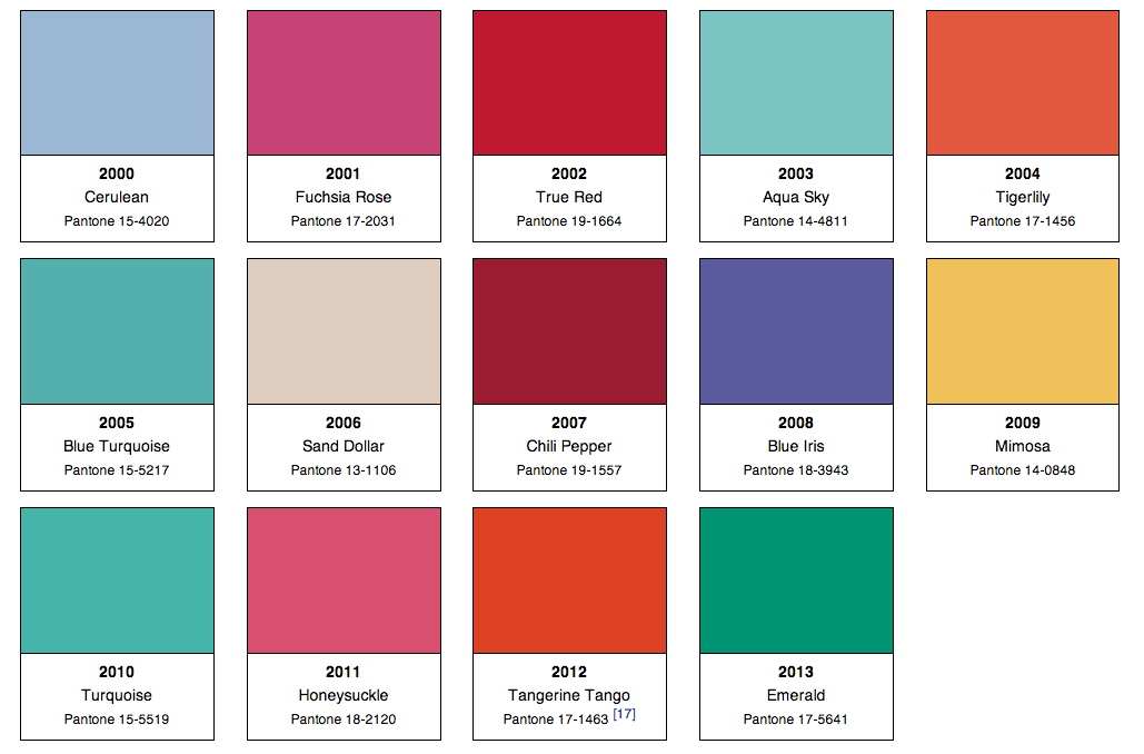
For printing there’s also a system of colors created by Pantone. These are used by brands for consistency in their print ads, billboards, point-of-sale pieces, etc. Many brands have had their own Pantone color created, which they’ve trademarked. Pantone actually has a color of the year award. They probably don’t poll lawyers on this. Actually, designers choose the colors of the year. In 2013, it was emerald.
HTML Color Codes
But, for our purposes, colors used on websites, though based on the RGB model, have evolved to be defined, for the most part, by an HTML color system.

So, when it comes to the exact colors on websites, designers use HTML color Hex Triplet codes. A hex triplet is a six-digit, three-byte hexadecimal number used in HTML, CSS, SVG, and other computing applications, to represent colors. The bytes represent the red, green and blue components of the color. All of the colors used on your website have their own specific hex triplet numbers.
Here are some examples:

Online Resources
There are some great resources online to help with picking and matching colors. One is Colorblender.com, which is great for seeing which colors blend well with others, and provides lots of options for matching colors. Another is Colorsontheweb.com, which has a “Color Wizard” that’s easy to use as well.
Emotional Responses
Let’s take a look at emotional and psychological underpinnings and responses to the primary and secondary colors. colors.
Red
Red, the R in RGB, is often associated with passion. It’s the color of blood. It’s also associated with energy, war, danger, strength, power, determination as well as desire, and love. Red is a very emotionally intense color. Studies have shown it can enhance human metabolism, increase the respiration rate, and raise blood pressure. It has very high visibility, which is why stop signs, stoplights, and fire equipment are usually painted red. In heraldry, red is used to indicate courage. It is a color found in many national flags.
Red brings text and images to the foreground. Use it as an accent color to stimulate people to make quick decisions; it is a perfect color for ‘Buy Now’ or ‘Click Here’ buttons on Internet banners and websites. In advertising, red is often used to evoke erotic feelings (red lips, red nails, red-light districts, ‘Lady in Red’, etc). Red is widely used to indicate danger (high voltage signs, traffic lights).
Light red is often used to represent joy, sexuality, passion, sensitivity, and love. Pink can signify romance, love, and friendship. It can denote feminine qualities and passiveness. Dark red is associated with vigor, willpower, rage, anger, leadership, courage, longing, malice, and wrath. Red is not a color often used by law firm websites, but as long as it’s not too dominant, it can provide a nice touch of passion.
Yellow
Yellow is the color of sunshine. It’s associated with joy, happiness, intellect, and energy.
Studies have shown yellow can produce a warming effect, arouse cheerfulness, stimulate mental activity, and generate muscle energy. Yellow is often associated with food, like we saw with the McDonald’s logo. Bright, pure yellow is a real attention getter, which is the reason taxicabs and school buses are painted this color.
When overused, yellow may have a disturbing effect; research has revealed that babies cry more in yellow rooms. Yellow is seen before other colors when placed against black; this combination is often used to issue a warning. In heraldry, yellow indicates honor and loyalty, but it has also been connected with cowardice, even in speech, where someone can be a yellow-bellied coward. Yellow is very effective for attracting attention.
But light yellow tends to disappear into white, so it usually needs a dark color to highlight it. Shades of yellow are visually unappealing because they lose cheerfulness and become dingy. For example, dull yellow can feel like, decay or sickness. This slide is a screen grab of the home page for IC Bus, the largest manufacturer of school buses in the country, and a former client of mine.
Blue
Our world has been referred to as the big blue marble. Blue is the color of the sky and sea. It is often associated with depth and stability. It symbolizes trust, loyalty, wisdom, confidence, intelligence, faith, truth, and heaven. Blue is considered beneficial to the mind and body. Studies show that it can slow human metabolism and produces a calming effect. Blue is strongly associated with tranquility and calmness. In heraldry, blue is used to symbolize piety and sincerity. It is a popular color in law firm websites, and clearly we understand why.
As opposed to emotionally warm colors like red, orange, and yellow; blue is linked to consciousness and intellect. Blue is also used by a lot of tech and internet companies as it suggests precision without being too cold. Blue was traditionally a masculine color, although this notion is evolving.
When used together with warm colors like yellow or red, blue can create high-impact, vibrant designs; for example, blue-yellow-red is a perfect color scheme for a superhero.
Light blue is associated with health, healing, tranquility, understanding, and softness. Dark blue has been used to represent knowledge, power, integrity, and seriousness.
Green
Green is the color of nature and conservation. It symbolizes growth, harmony, freshness, and fertility. Green has strong emotional correspondence with money. Green also is known to represent healing power. It is the most restful color for the human eye; it can improve readability. Green suggests stability and endurance. Sometimes, especially in language, green denotes lack of experience; for example, a ‘greenhorn’ is a novice. In heraldry, green indicates growth and hope. Green, as opposed to red, means safety; it is the color of free passage in road traffic.
While darker green is commonly associated with money, it is commonly used by the financial world, banking, and Wall Street.Dark green is also sometimes associated with ambition, greed, and jealousy.Law firms should avoid using yellow-green, which has unpleasant connotations and can indicate sickness, cowardice, discord, and jealousy.
But aqua is associated with emotional healing and protection and olive green is the traditional color of peace.
Orange
Orange combines the energy of red and the happiness of yellow. It is associated with joy, sunshine, and the tropics. Orange represents enthusiasm, fascination, happiness, creativity, determination, attraction, success, encouragement, stimulation, and Halloween and candy.
To the human eye, orange is a very hot color, so it gives the sensation of heat. Nevertheless, orange is not as aggressive as red. Studies show that orange increases oxygen supply to the brain, produces an invigorating effect, and stimulates mental activity. It is highly accepted among young people. As a citrus color, orange is associated with healthy food and research has shown it can stimulate the appetite, so it is very effective for promoting food products. Orange has very high visibility, so you can use it to catch attention and highlight the most important elements of your design. Orange is also a color associated with fall and harvest. In heraldry, orange is symbolic of strength and endurance.
A close relative of orange is Gold, which can evokes the feeling of prestige. The meaning of gold is illumination, wisdom, and wealth. Gold often symbolizes high quality.
Orange is a tough color for use by law firms, except, maybe in small accents, like call-to-action buttons or borders, but even then it must be used exceedingly sparingly.
Still, used more than this, orange could become a concern for a law firm’s website. And, it can be a challenge to use accent colors effectively in other branding pieces. So, if you decide to use a strong accent color, like orange, on your website’s homepage, ask yourself how the color will work in the rest of your marketing efforts. The smartest brands have an integrated look throughout all of their advertising, and consistently incorporating orange may be a real challenge, so integration may have to be sacrificed at times.
Purple
Purple combines the stability of blue and the energy of red. Purple is associated with royalty. It symbolizes power, nobility, luxury, and ambition. It conveys wealth and extravagance. Studies show that people associate purple with wisdom, dignity, independence, creativity, mystery, and magic.
According to surveys, almost 75 percent of pre-adolescent children prefer purple to all other colors. Purple is a very rare color in nature; some people consider it to be artificial. Light purple can evoke romantic and nostalgic feelings. Dark purple can evoke gloom and sad feelings and can cause feelings of frustration.
White
White, technically, is the absence of color…but nonetheless it is very prominent on the web. Many brands, like Google and Apple use white with great effectiveness. White is associated with light, goodness, innocence, purity, and virginity. It is considered to be the color of perfection.
As opposed to black, white usually has a positive connotation. White can represent a successful beginning. In heraldry, white depicts faith and purity. In the SEO world, people refer to White Hat Tactics to refer to good, ethical practices, which harkens back to the wild west with the sheriff and the good guys wearing white hats. White is used by charitable organizations and is associated with hospitals, doctors, and sterility.
In advertising, white is associated with coolness and cleanliness. It is used to suggest simplicity in high-tech products, as Apple and Google have done so well. White is also associated with space-age technology, like spacesuits, rockets and NASA.
Black
Black used to be a real doomsday color. But designers have found ways to use it to convey solidity, consistency and power. It can feel sleek and modern. Black is associated with elegance and formality, but also death, evil, and mystery. Black is sometimes associated with fear and the unknown (like with black holes). In language, it can have a negative connotation (blacklist, black humor, black death and black hat SEO techniques). But black can also denote strength and authority and is considered to be a very prestigious color (judge’s black robes, black tie event, little black evening dress, and black limos). In heraldry, black is the symbol of grief.
Black gives the feeling of perspective and depth, but a black background can diminish readability. A black suit or dress can make you look thinner. Black contrasts well with bright colors. Combined with red or orange – other very powerful colors – black gives a very aggressive color scheme.
Choosing The Best Legal Website Colors
So, how do branding experts decide on a company’s colors? It’s obviously not as simple as picking your favorite color. It’s finding ways for colors to help tell your story in believable, authentic ways.
They start by remembering what the company is specifically all about. They focus in on the company’s Unique Selling Proposition, and lay out all of the exact reasons-to-believe the proposition. Many then perform a Competitive Review, exploring what other colors are used, and their effectiveness, within the company’s category. So, ask yourself, in regards to your law firm:
- What is your law firm’s Unique Selling Proposition?
- What are the Reasons-To-Believe believe your USP?
- What are your competitor’s marketing efforts looking like?
- What colors represent your proposition the best?
When handled right, colors can help tell your law firm’s story, and to provide a backdrop for the wording, the contact information, and all of your calls-to-action.
Another way to think about this, is to ask yourself and every other key decision-maker at your firm:
- What do you stand for?
- What makes your firm special and different from your competitors?
- And check out what your competitors are doing on their websites, color-wise?
- Also, what are potential new clients looking for?
- What emotions are they probably feeling and what colors will connect with those emotions?
- Are there visual cues that you want to bring in from your practice areas, locality or actual physical office to help tell your story and connect with the online world?
Finally, it may best to think of colors as a template to lay your story out upon. Similar to your office, when potential clients come to visit, how do you want them to feel? A green couch is one thing, an entire office painted green is obviously something to be avoided.
To explore how easy picking the best colors for your website is when you use LawLytics, request a 20-minute interactive demo.
